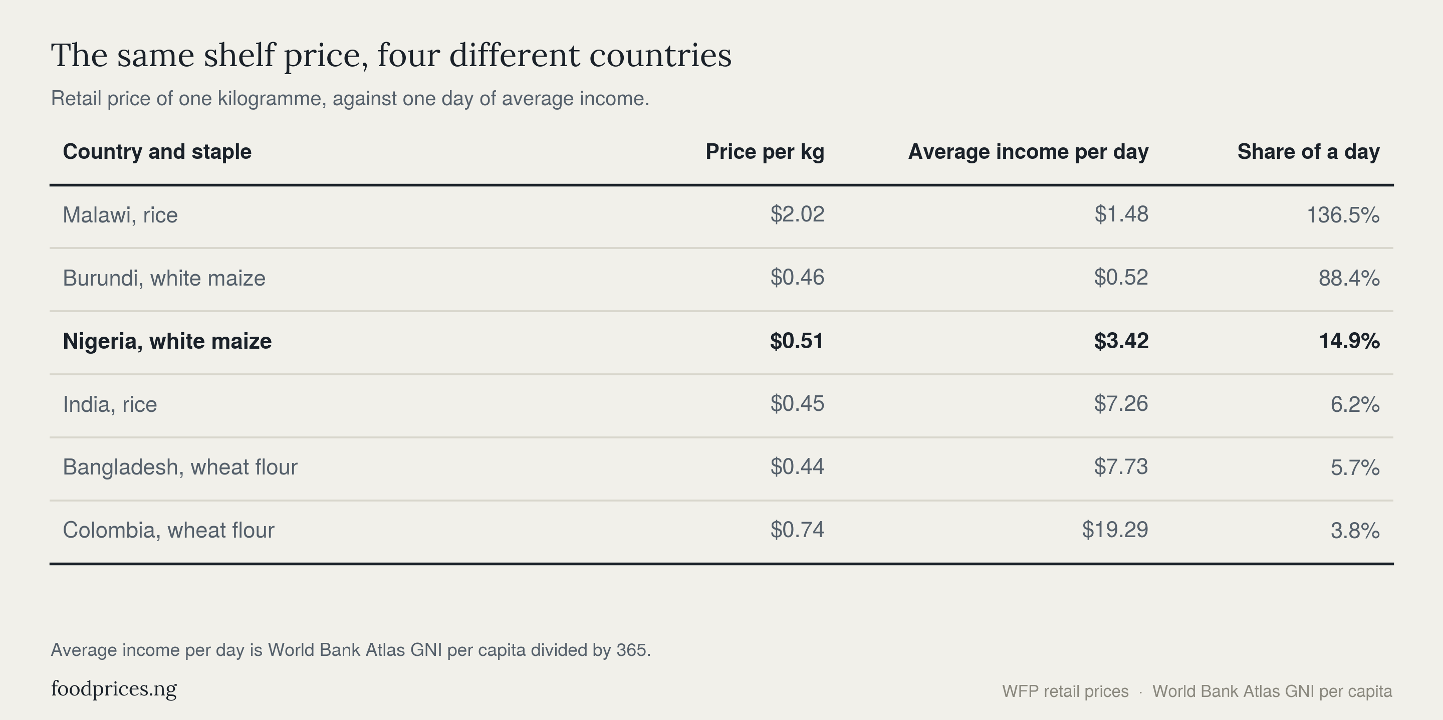
A kilogramme of wheat flour in Colombia costs $0.74. A kilogramme of white maize in Burundi costs $0.46.
By the only measure most people ever see, the shelf price, Burundian food is the cheaper of the two. It is 38% cheaper.
Now price the same two purchases in the thing families actually spend, which is their working time. That Colombian kilogramme takes 3.8% of a day's average income. The Burundian kilogramme takes 88.4%.
Same food group, cheaper price tag, twenty-three times the burden. This is the finding, and it repeats across fifty-five countries.
A single honest measure
The measure used throughout this article is simple enough to state in one line. Take the retail price of one kilogramme of a country's main staple, take that country's average income for one day, and ask what share of the day the kilogramme costs.
Average income here is World Bank gross national income per capita divided by 365. It is a crude daily wage, and the article returns later to why it flatters every country in the table.
Six countries show the whole calculation. A Malawian earns $1.48 a day on average and pays $2.02 for a kilogramme of rice. A Burundian earns $0.52 and pays $0.46. A Nigerian earns $3.42 and pays $0.51. An Indian earns $7.26 and pays $0.45, a Bangladeshi $7.73 and $0.44, a Colombian $19.29 and $0.74. The prices barely move. The incomes move by a factor of thirty-seven.
On that measure the world's food map does not merely tilt. It inverts.
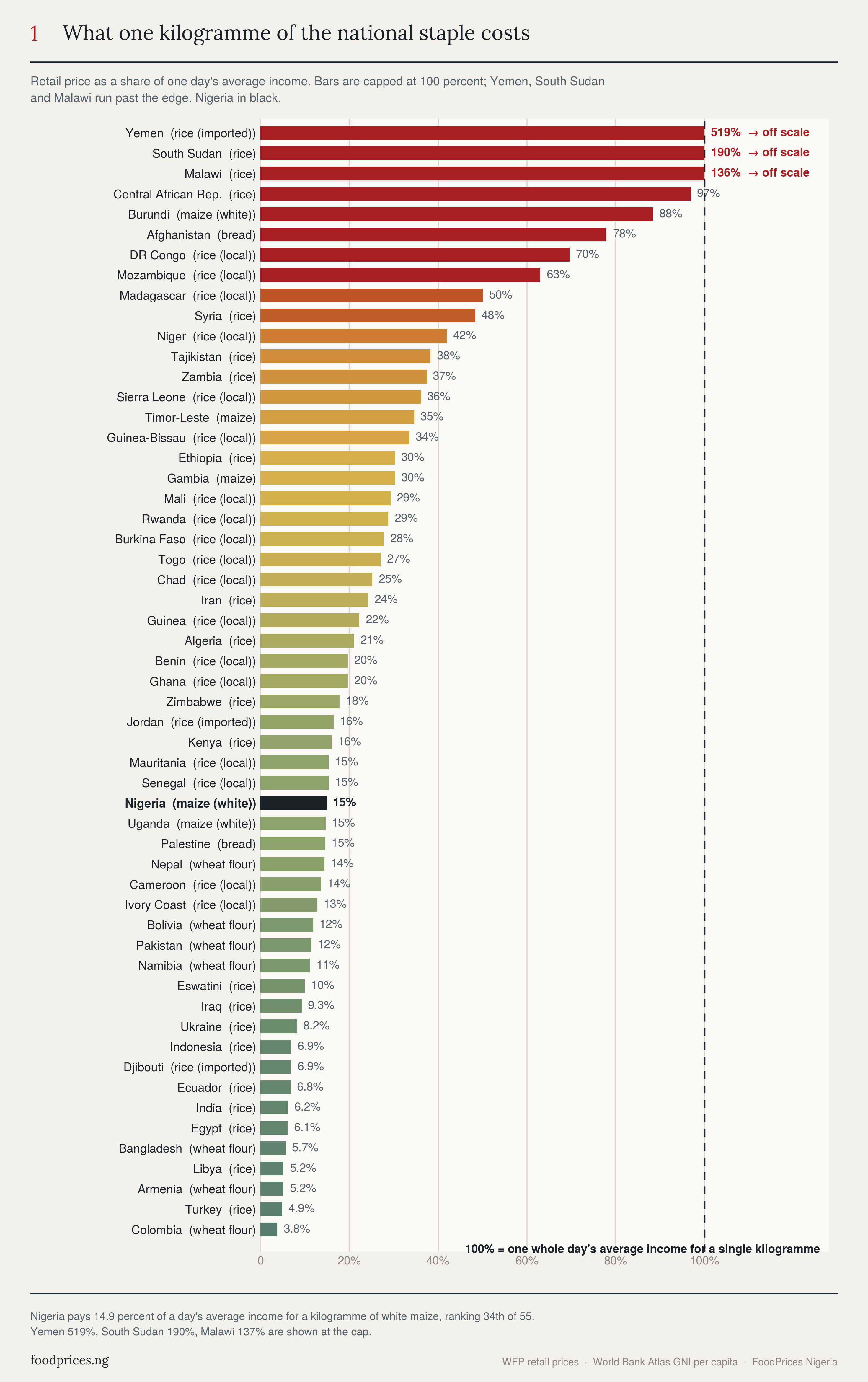
At the top sit countries where a single kilogramme costs most of a day or more than a day. Malawi 136.5%. Burundi 88.4%. DR Congo 69.6%. Mozambique 63.0%. At the bottom sit Colombia at 3.8%, Turkey at 4.9% and India at 6.2%.
The gap between the heaviest and the lightest burden in this dataset is a factor of 137.
The gradient runs the wrong way
Group the countries by region and the pattern stops looking like a scatter of unlucky places and starts looking like a slope.
Sub-Saharan Africa pays a median 30.3% of a day's income for a kilogramme of staple. West Africa pays 24.7%. South East Asia and the Pacific pay 20.8%, though that figure rests on only two countries and should be held loosely. The Middle East and North Africa pay 15.6%. South Asia pays 8.8%. Latin America pays 6.8% and Central Asia 6.7%.
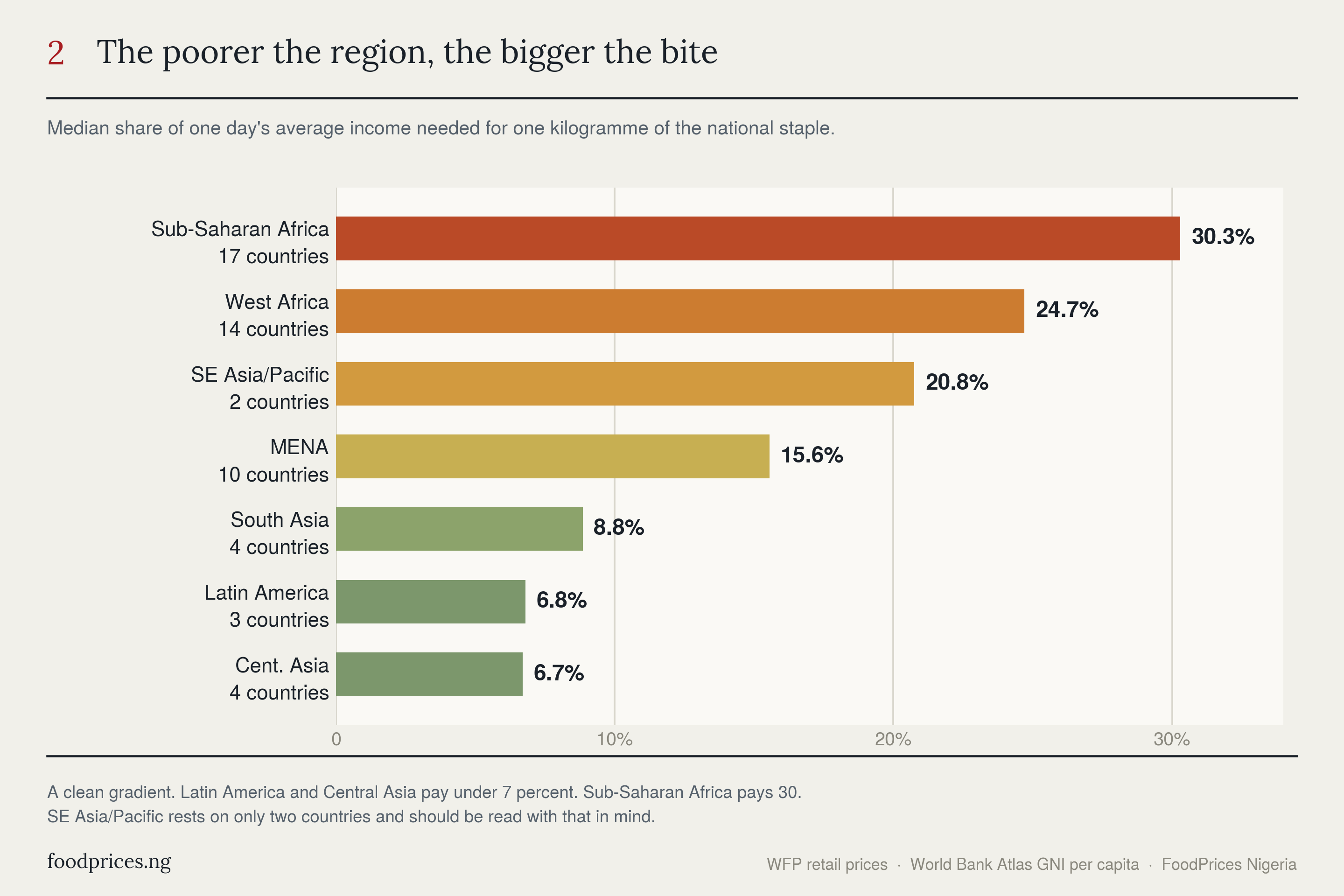
Read that list in either direction and it says the same thing. The poorer the region, the larger the share of the day that one kilogramme of the cheapest food consumes. There is no point on the slope where the ordering breaks.
Why cheap in dollars is a lie
The instinct behind the dollar figure is not stupid. It assumes that poor countries have cheap food, that a dollar goes further in Lilongwe than in Bogotá, and that the shelf price is therefore a reasonable guide to how hard the food is to obtain.
Plot income against burden and that assumption collapses.
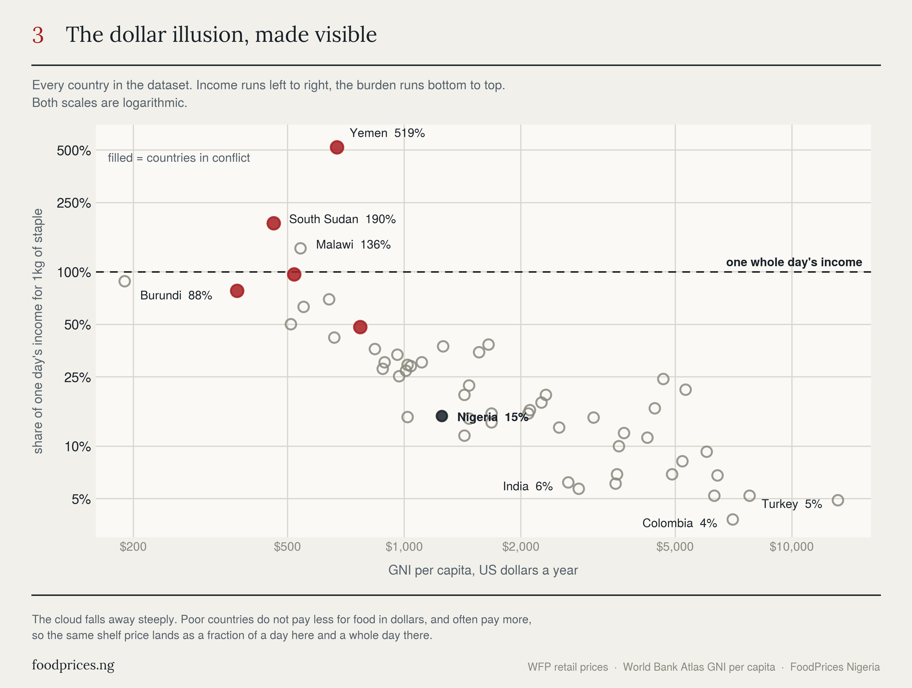
The cloud falls away steeply from left to right. But the important detail is what does not happen. Staple prices in the poorest countries are not dramatically lower than in the richest ones in this dataset, and in several cases they are higher. Malawian rice at $2.02 costs nearly three times Colombian wheat flour at $0.74. Tajik rice at $1.73 costs more than Indian rice at $0.45, four times over.
So the burden gap is not mostly a price story at all. It is an income story wearing a price story's clothes. Two countries can face almost the same number on the shelf and experience it as completely different goods, because one of them earns fifteen times what the other earns.
There is a mechanism underneath this, and it is not mysterious. The poorest countries in this table import the staple they eat, or move it over long distances on bad roads with expensive fuel, or both. Cheap food is a function of dense infrastructure, deep markets and a currency that holds its value. Those are precisely the things poor countries do not have. So the price does not fall to meet the income. It stays roughly where it is, and the income falls away beneath it.
A month of food, measured in days of work
The share of a day is an abstraction. Convert it into a shop and it becomes concrete.
Ten kilogrammes of a staple is roughly a month of grain for one adult. Ask how many days of average income buy that sack.
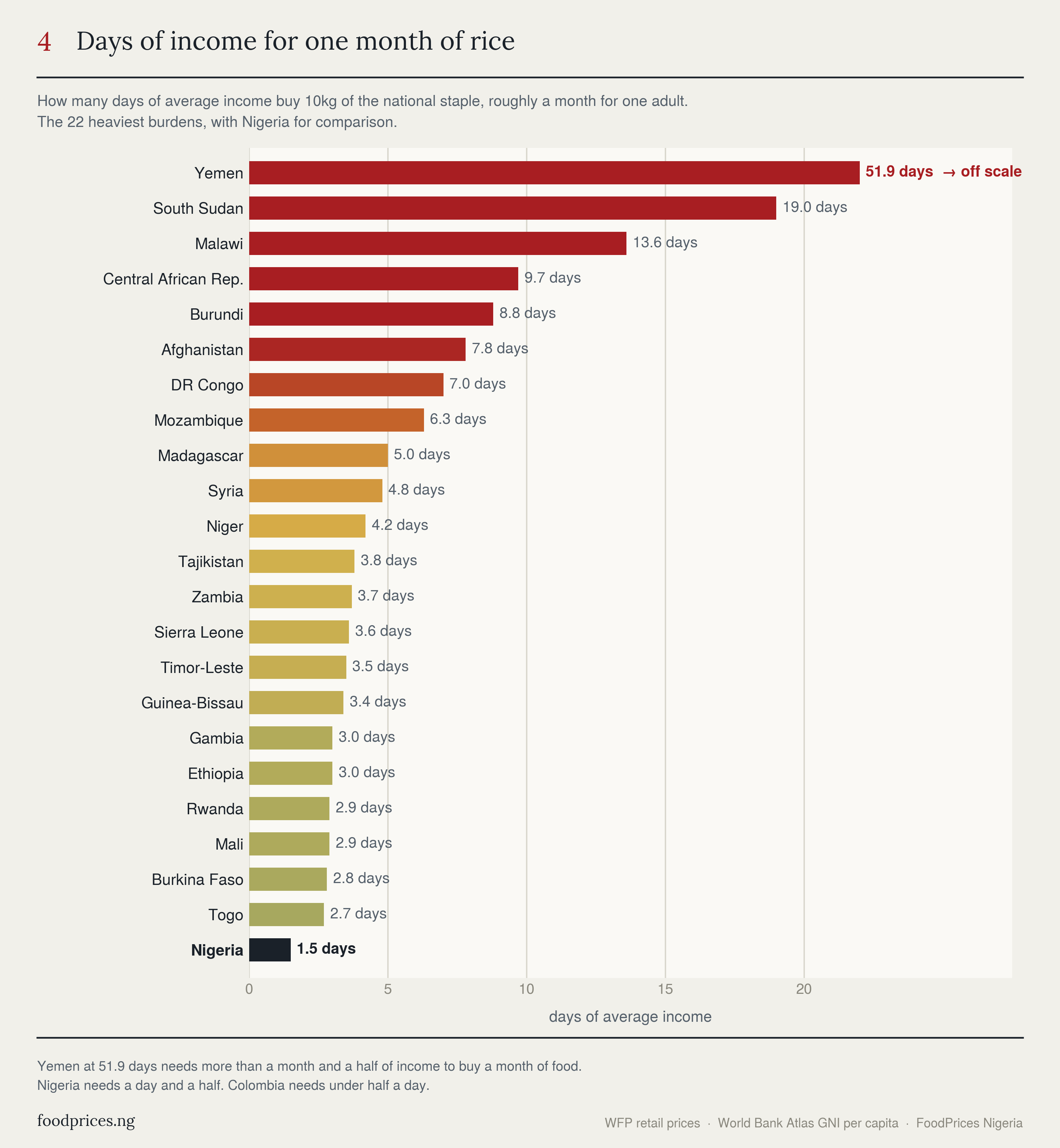
In Malawi it takes 13.6 days. In Burundi 8.8. In DR Congo 7.0. In Madagascar 5.0. Those are days of a whole national average income, spent on grain alone, for one person, before anything else is bought.
In Colombia the same sack takes under half a day.
Where Nigeria sits
Nigeria pays 14.9% of a day's average income for a kilogramme of white maize at $0.51, which places it 34th of the 55 countries measured. Ten kilogrammes takes about a day and a half of average income.
That is neither the disaster of Malawi nor the comfort of Colombia. It is the middle of the developing world, and it is a considerably worse position than the raw dollar price suggests, because $0.51 is one of the cheaper staple prices anywhere in the table. Nigerian maize is genuinely inexpensive by world standards. Nigerian incomes are what make it expensive.
The direction of travel matters more than the rank. Nigeria's Atlas income per head fell from around $2,590 in 2023 to $1,250 in 2024 as the naira was floated. The maize did not change. The denominator did. That is the same mechanism FoodPrices Nigeria found in Lagos, where the staples basket tripled in naira while falling 21% in dollars, and it is why the dollar price of Nigerian food keeps looking reassuring while the shop keeps feeling worse.
The gulf, in one image
Set the eight most burdened countries against the eight least burdened, with the shelf price written beside each, and the argument finishes itself.
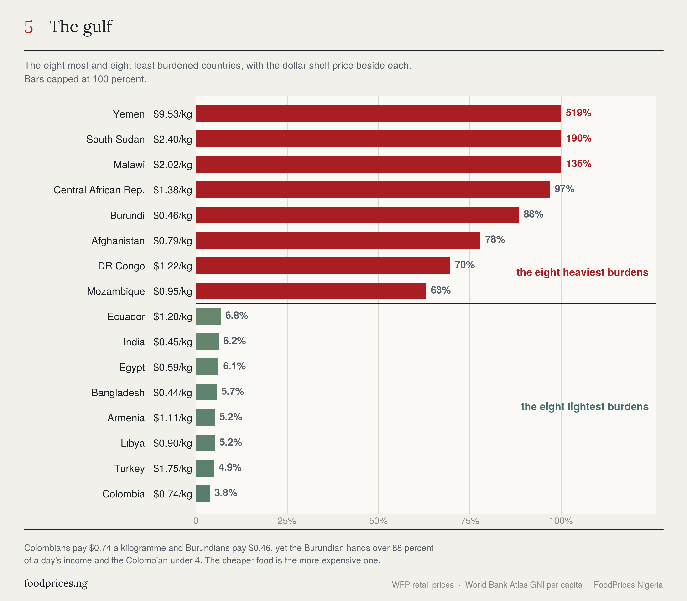
The cheapest food in the entire dataset, Bangladeshi wheat flour at $0.44 and Burundian maize at $0.46, sits on opposite sides of the gulf. Bangladesh pays 5.7% of a day. Burundi pays 88.4%. Two cents apart on the shelf, fifteen times apart in what they cost to earn.
Three honest limits
These figures are floors, not ceilings, and three things should be said plainly.
Gross national income per capita is an average, and averages hide the poor. The people who actually spend most of their income on staples earn well below their national mean, so the true burden for a poor household in Malawi or Burundi is worse than 136% or 88%, not better. Every number in this article understates the problem it describes.
The dataset contains no rich countries. The World Food Programme monitors prices in developing and crisis economies, so this is a comparison within the poorer half of the world rather than a global league table. A German or American reading would sit far below Colombia's 3.8% and would make the inversion starker still.
Two of the largest figures rest on old income data. Yemen's 519.2% uses a 2020 income estimate and South Sudan's 190.4% uses a 2016 one, because the World Bank has published nothing more recent for either. Both countries have suffered war and currency collapse since. The direction is not in doubt and the precision is. Those two, along with Syria, Afghanistan and the Central African Republic, are crisis readings rather than ordinary market ones, and the everyday inversion holds firmly without them.
How we worked it out
Staple prices are World Food Programme retail market monitoring, converted to US dollars per kilogramme. Each country is represented by the staple its own population eats most, which is why Nigeria appears as white maize and Bangladesh as wheat flour rather than forcing every country onto rice.
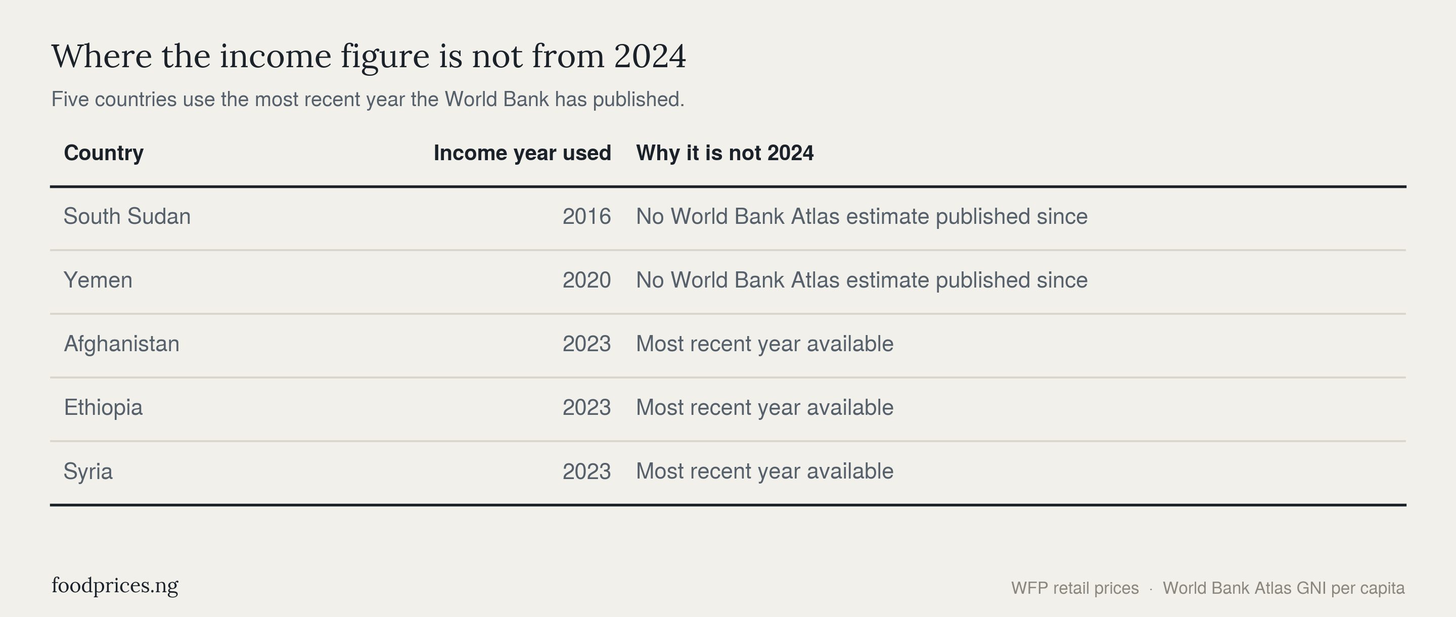
Income is World Bank gross national income per capita, Atlas method, 2024 where available, divided by 365. Five countries use an earlier year, because the World Bank has published nothing more recent for them: Ethiopia, Syria and Afghanistan for 2023, Yemen for 2020, and South Sudan for 2016.
Regional medians use medians rather than means so that a single crisis country cannot drag a whole region. Region membership is listed in full in the dataset published with this article, so any reader can check the grouping rather than take it on trust.
Nigeria's current market prices are live and checkable, market by market, at foodprices.ng. International prices are the World Food Programme's market data and incomes are the World Bank's Atlas GNI per capita. Analysis by FoodPrices Nigeria.
Questions readers ask
Which country pays the most for food relative to income? Yemen, at 519.2% of a day's average income for a kilogramme of imported rice, though that rests on a 2020 income estimate and reflects war and currency collapse. Among countries not in conflict, Malawi is highest at 136.5%, meaning one kilogramme of rice costs more than a whole day's average income.
Is food actually cheaper in poor countries? Usually not by much, and often not at all. Malawian rice costs nearly three times Colombian wheat flour in dollars. The idea that poor countries have cheap food confuses low incomes with low prices. Cheap food requires infrastructure, competitive markets and a stable currency, which are the things poor countries lack.
Where does Nigeria rank? Thirty-fourth of 55, at 14.9% of a day's average income for a kilogramme of white maize. Ten kilogrammes takes about a day and a half of average income. Nigeria's staple price of $0.51 is low by world standards; its position on this list is driven by income, not by the price of maize.
Does this mean the numbers understate the problem? Yes. GNI per capita is a national average and the households that spend most heavily on staples earn less than that average, so the real burden on a poor family is higher than every figure quoted here.
Why are there no rich countries in the comparison? Because the World Food Programme monitors prices where food insecurity is a live risk, which means developing and crisis economies. The comparison is therefore within the poorer half of the world. Including rich countries would widen the gap, not narrow it.
Data used in this research can be found in https://foodprices.ng/data/foodprices-staple-affordability-55-countries.csv